How to take great photos
by Hawkr x Eric, Founder of Cubes Co Bakery Studio (a beginner’s guide).
Appeal to curious customers without spending on professional photography.
This is a guide for taking food photos for your menu. Not sure how to capture the perfect cover photo, check out this guide instead (coming soon).
“People eat with their eyes first.” We all know this saying. If you’re already starting to think of uploading photos of your menu items, congratulations! You’re almost there because photos have the ability to bring your online store to life.
Whether you’re taking food photos for the first time or you want to update your existing photos to showcase improvements and changes, snapping high-quality images with your smartphone is easier than you think. We’ll walk you through each step so you can do it yourself.
Here are a few tips from Hawkr in collaboration with one of our pioneer merchants, Eric of Cubes Co Bakery Studio!
1. Change your smartphone camera settings.
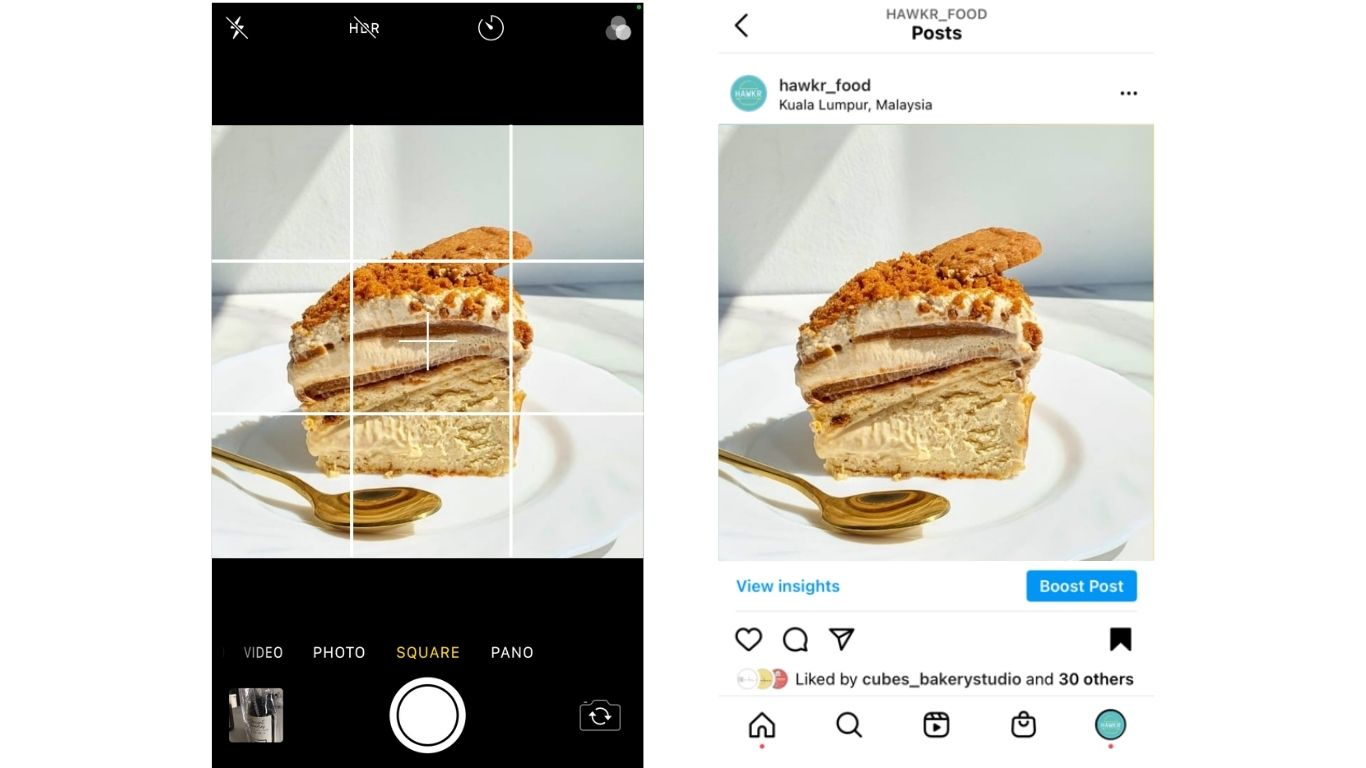
We highly recommend enabling grids to help you position your photos better.
- For iPhone: Go to Settings > Camera and from there you can toggle your phone’s grid to On.
- For Android: Launch the camera app, go to Settings, scroll down, and switch the Grid lines option to On.
Once you have enabled grids, here’s Eric’s top tip. If possible, try to use a 1:1 (square) aspect ratio because it will allow you to upload the exact same photo onto Instagram since Instagram also follows a 1:1 (square) aspect ratio. It’s also a lot easier for us to promote your photos on Hawkr’s Instagram! When customers visit Instagram and see your photo, they can easily recognise the same photo on your online store on Hawkr.
2. Goodbye flash, hello natural light.
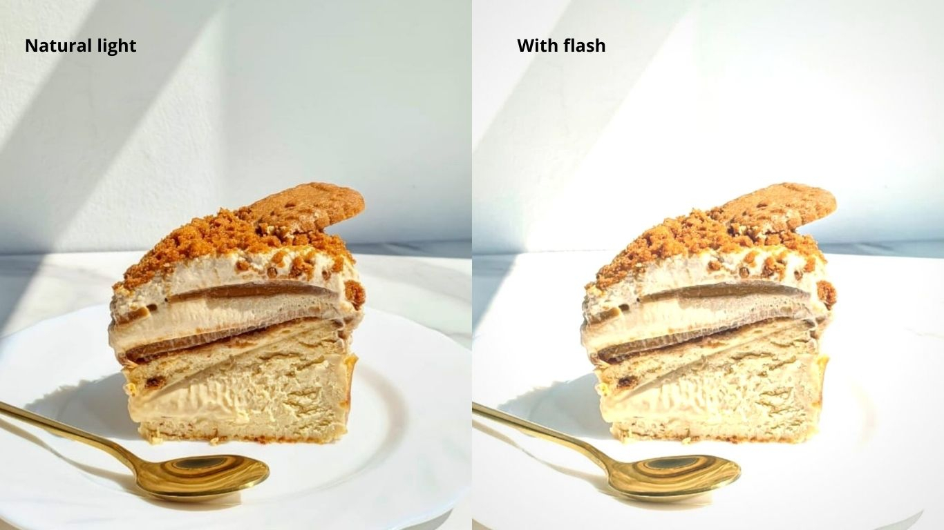
You want your food to look inviting and vibrant. Unfortunately, flash photography creates a harsh look. Compare the two images below. Notice how the food photo with natural lightning looks more appealing and warm.
According to Eric, 11 am - 2 pm, which is the brightest time of the day, is the best time to take photos of your food. You will get all the natural light you need during that time!
Petite o’ Bakez’s Biscoff Tiramisu Burnt Cheesecake
3. Angles, angles, angles!
This is where you get to go crazy, be creative, and have fun. Angles can change the way your food looks dramatically. There isn’t a correct way to capture the best angle. You wanna know why? Because you know your food the best. You’ve come up with the recipe, carefully chosen and prepared the ingredients, and cooked the food. Now it’s up to you to decide how you want your customers to see your food. Here are some points to consider.
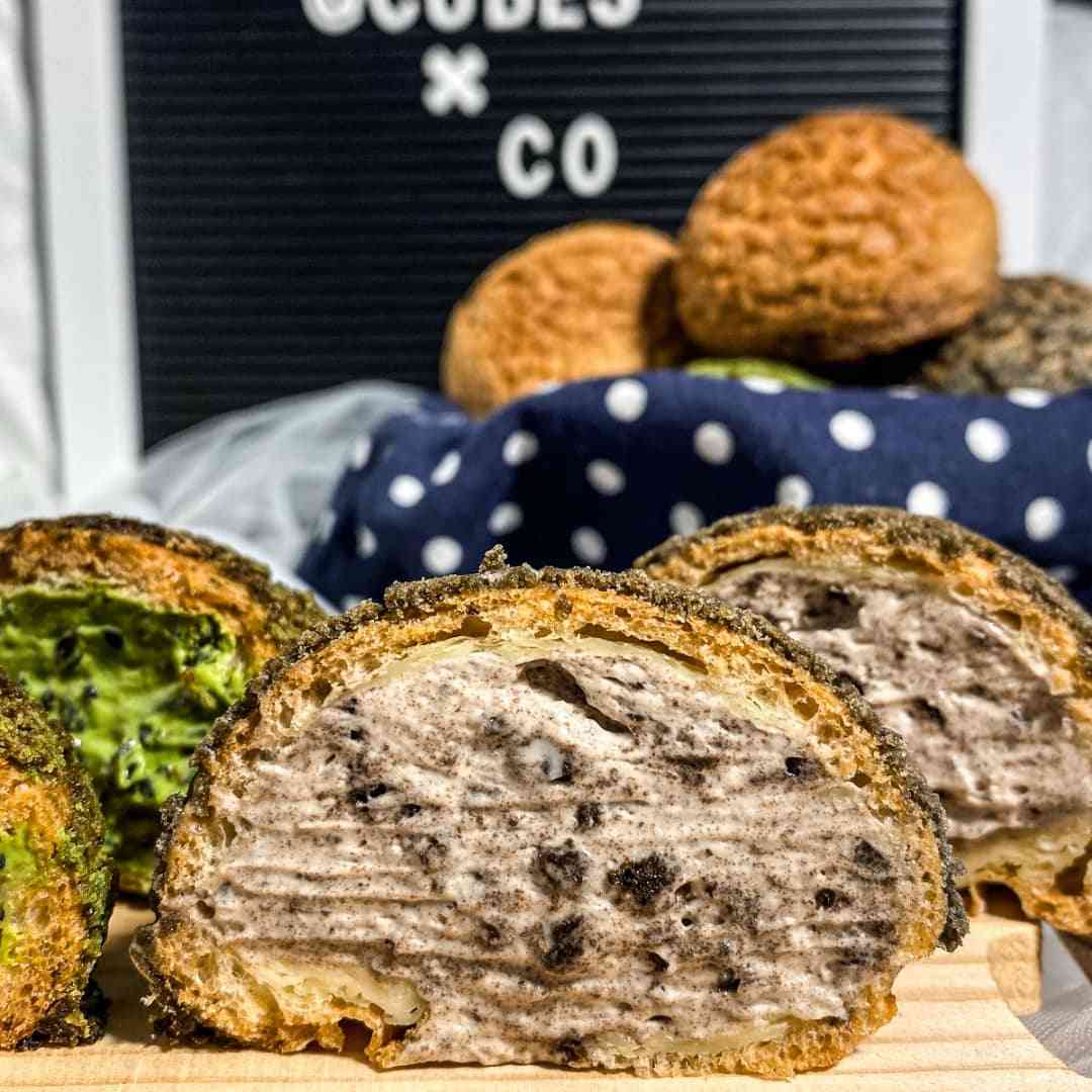
i) If your unique selling point is the quality of your ingredients, close-up shots of your food and its contents may do the trick. This is recommended especially for cakes and other baked goods where customers usually wonder what’s inside! Here’s how our merchant, Eric from Cubes Co does it.
Photo of Cubes Co Bakery Studio’s Cream Puff (Cookies and Cream)
As you can see, cutting the cream puff in half and taking a close up shot of the filling gives customers a good idea of what’s inside!
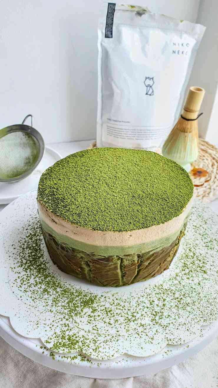
Here’s a bonus tip if you are using quality ingredients. If you are using ingredients from a well-known brand, we also recommend showcasing that brand in the background. Here’s an example of how Petite o’ Bakez, another pioneer merchant, showcases that she uses Matcha powder from Niko Neko in the background, a very well-known Matcha brand among Klang Valley folks.
Petite o’ Bakez’s Matcha Tiramisu Burnt Cheesecake using Niko Neko’s Matcha Powder
ii) If your unique selling point is any of the following:
- Overall aesthetics
- Portion Size
- Multiple components of one dish (think beloved Malaysian dishes like Nasi Lemak, Curry Mee, Laksa, and Banana Leaf Rice)
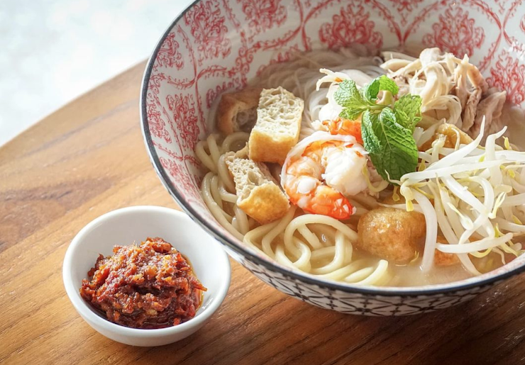
We highly recommend a top-down shot like this. This is a photo of Tsuka’s White Curry Mee where you can clearly see the ingredients that make up this wonderful dish.
Can you think of any more angles to play with? After all, you know your food better than we do so go ahead, go crazy and experiment!
Photo of Tsuka’s Famous Penang White Curry Mee
4. Just like angles, experiment with different backgrounds with only a few rules to stick to.
Eric recommends using a simple and plain background with minimal props to draw more attention to your food. If you have no idea what to do, you can’t go wrong with going simple and plain. Here are a few examples.
The bottom line is you want to be intentional with your background. Do not accidentally capture a photo with a random person, item, or other foods not being sold in the background because you take the focus away from your food and also your brand identity. Here’s an example of what we mean by this. As you can see, Eric uses a plain white background with only one type of prop (plants) in the background. These plants add a little more colour to the background but most importantly, notice how the plants are only on the corners of the photo. This centres subject, which is the cake, and that’s what makes this a great photo for your online store.
Photo of Cubes Co Bakery Studio’s Pandan Gula Melaka Box Cake
5. “Okay, I did everything you asked me to but it still feels like there is something missing from my photos.”
Depending on your smartphone, there is only so much we can do but this is where photo editors come to the rescue! For Eric, he prefers Lightroom and Snapseed (it’s free!). But hey, we’re here to help too (also free!). All Hawkr merchants are entitled to send support requests here. Fill up the form and let us know you need photo-editing help and we’ll get on it as soon as we can. Speaking of the support request feature, here’s an article you don’t want to miss (coming soon). We’ll be teaching you how to take advantage of Hawkr’s free support services to help grow your business.
Remember, photos can be improved and updated as you develop your brand identity. Everything you capture and upload to your online store is not permanent. Let this be the start of a very wonderful (and delicious) journey. Good luck and have fun!
© 2022 Hawkr Pte. Ltd. All rights reserved.
