6 tips to be on your way to becoming a successful Hawkr merchant
Welcome! So, you’ve set up your account with us. Now what? Where to begin? How do you make sure you’re starting out on the right foot? If you’re worried and unsure, it’s okay. We’re here for you. Follow these 6 tips and you will be on your way to becoming a successful Hawkr merchant.
1. Take great photos
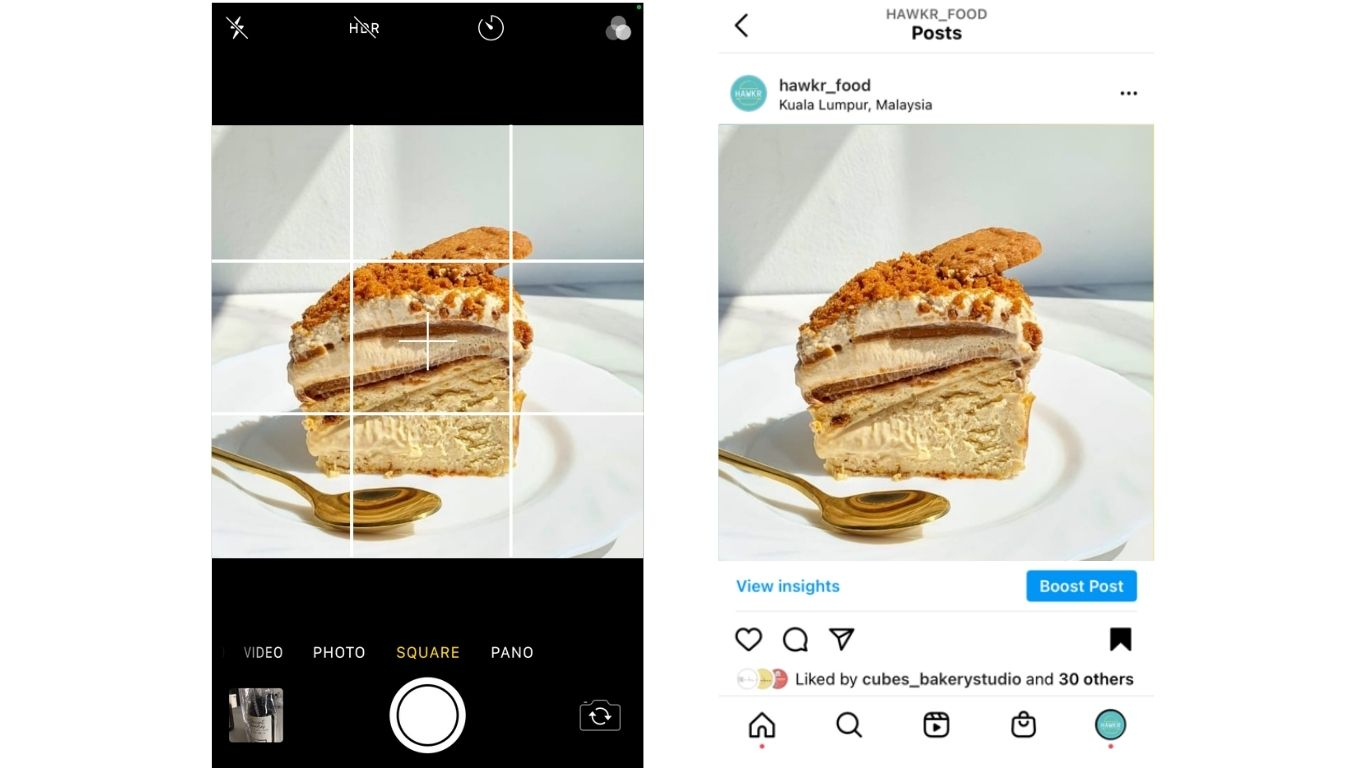
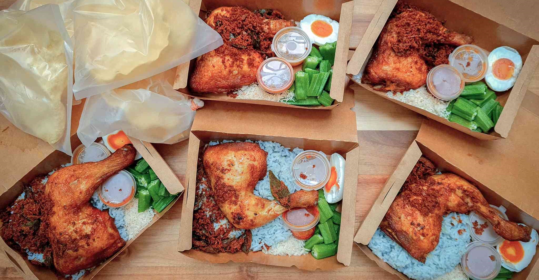
It is no secret that people eat with their eyes. Once you start uploading photos to your menu, you’re already halfway there because photos can bring your online store to life. You probably have many questions such as “My photos so low-quality lah. How ah?” or “What angle is the best?”. Here’s a secret. You do not need to hire a professional photographer to take great photos. You can do it all with a simple smartphone with a few techniques which we explain in detail here.
Since we already have an article which goes into detail about how to take great photos, we’re here to explain why you should not overlook this key aspect of your online store. As an online store, there are fewer indicators or signals to how established a business is. Physical stores can rely on aesthetics, location, and ongoing word of mouth. For online stores, high quality and beautiful photos not only help establish your brand identity, but they are also crucial when it comes to giving customers a great first impression. We will go into more detail on how to build trust with your customers in the near future. For now, we invite you to think not as a merchant but as a customer.
2. The rule of three: 3 categories, 3 menu items
Consider this. You walk into a mall and see two restaurants. Both serve great food. However, one restaurant only serves nasi lemak whereas the other has nasi lemak, kuih-muih, and drinks. It is highly likely that you would eat at the restaurant with more variety kan?
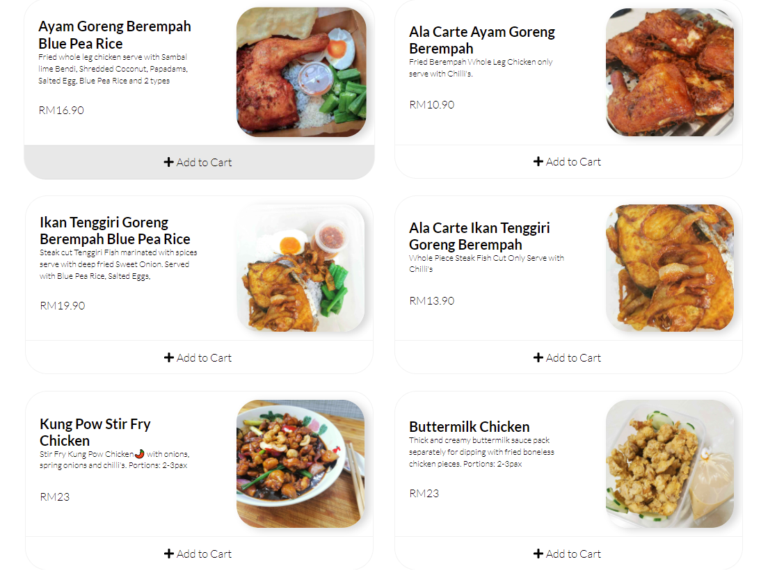
This is why we highly recommend having three different categories of menu items with at least three variations within each category. Here are two great examples of our current merchants.
Check out Cubes.Co Bakery Studio
Notice how they have round cakes, loaf cakes, and cookies. And within each category, there are different flavours to choose from.
Check out EAT Kitchen
EAT Kitchen is a wonderful example of how each category does not have to be extremely different from each other. They have dishes that come with rice, dishes that don’t come with rice, as well as snacks!
Here are even more reasons why you should have at least 3 categories with at least 3 menu items per category (article coming soon).
3. Descriptions Descriptions DESCRIPTIONS
Bad example: (Salted Egg Nasi Lemak) Nasi lemak with salted egg sauce, 1 pax
Good example: (Salted Egg Nasi Lemak) Nasi lemak with spicy & sweet sambal, anchovies, kacang, and cucumbers served with creamy, rich, salted egg sauce on the side, 1 pax
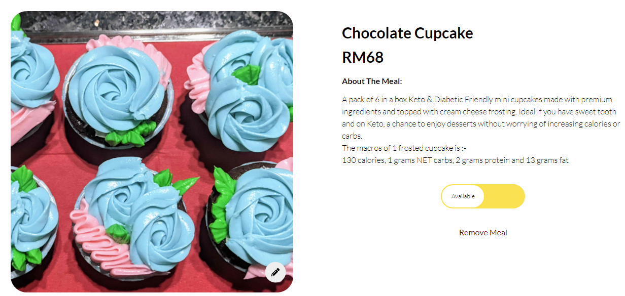
As a passionate cook or baker, you know that every component of the dish has to be made with care and thought. The same applies to your online store. You already have great photos, so now is the time to appeal to your customers even more with descriptions. Why is this important?
i) It sets the right expectations with customers. Some customers may have questions about portion size, prefer certain flavour profiles, or may be allergic to certain food items. A thorough description helps customers manage expectations. We don’t want to turn customers away just because your descriptions are unclear.
ii) Just like beautiful photos, beautiful descriptions can also give a better impression of your food and your brand.
4. Reduce preorder hours
This is a tricky subject to tackle. We know our super home cooks and home bakers may not necessarily operate at the capacity of industrial kitchens. Nothing wrong with this at all! At the end of the day, no matter how many restaurants Malaysians visit, we all love homemade food. This is why Hawkr has a preorder feature that other platforms do not.
We highly recommend reducing preorder hours as much as you can handle. After all, we know hungry Malaysians cannot wait to take a bite out of your food! Because this is a more complex topic, we will post another article soon on how to reduce preorder hours without putting a strain on your business. If you need help immediately, click here and let’s talk!
5. An engaging bio is important. Customers want to know the stories behind the food!
Your bios have the ability to make a good first impression on customers. There is so much more to your food besides the ingredients, pricing, and descriptions. Take the time to brainstorm how you can set your brand apart from everyone else’s. Are you unique because of a special ingredient you use? Or perhaps your dishes and recipes are passed down through generations!
Here’s a good starting point. Ask yourself this question. What do you want customers to know when they eat your food, snack, dessert, etc.? Want us to brainstorm with you? Let’s join heads and talk.
6. Create and upload a banner!
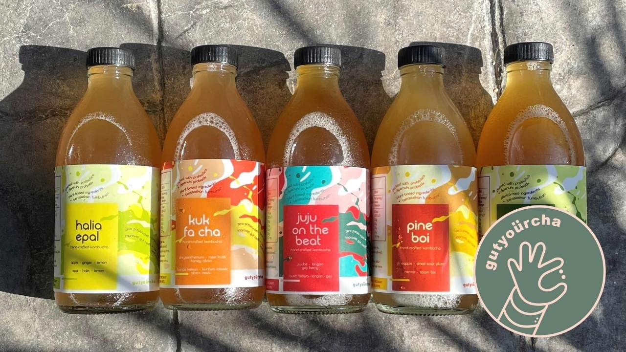
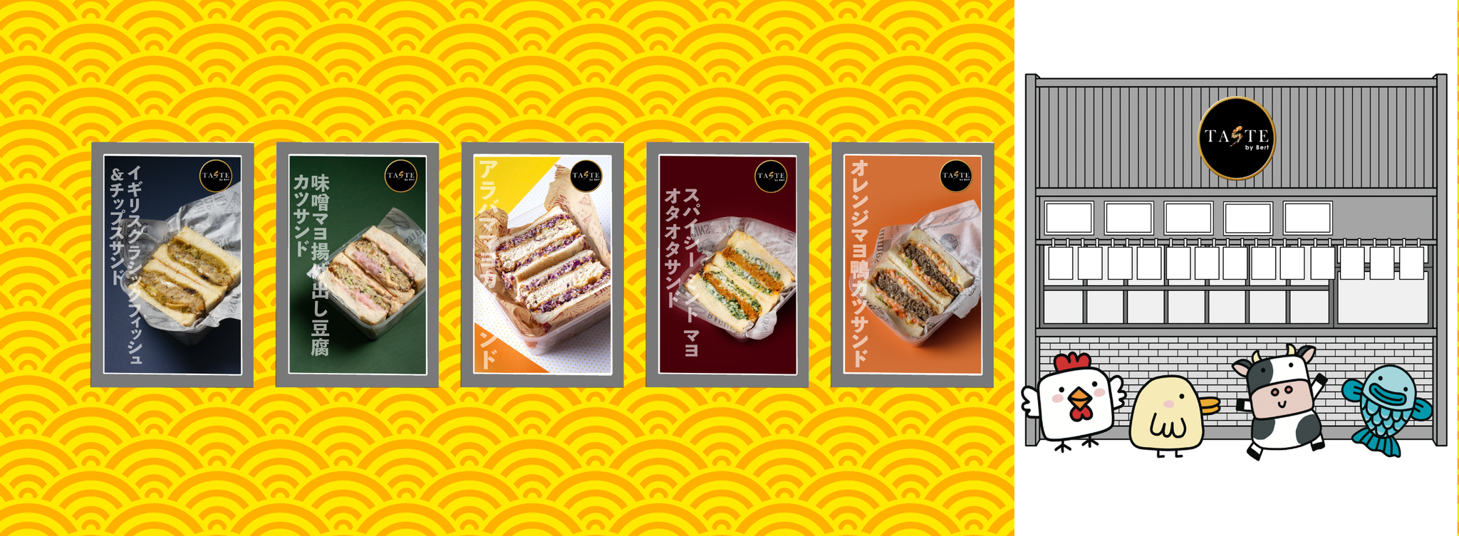
Similar to the above tips, don’t forget the icing on the cake: your banner! This is the largest photo on your online store. This means it has to catch customers' attention when they visit your page. When designing your banner, make sure the height:width ratio is roughly 5:16 with a minimum height of 300px. Need help? Let us know here.
For this, we'll talk less and show more.
There you have it! These are 6 steps you can take to bring your online store to the next level. While it may take a while to start seeing some traction, ensuring you have these 6 steps in place may help accelerate the process. Now go forth and start your journey better prepared!
© 2022 Hawkr Pte. Ltd. All rights reserved.
